

Introduction to EDA
Exploratory data analysis (or EDA) is a way to analyse data sets in order to summarize or to know about their main characteristics, often by analysing trends and through graphics and other data visualisation methods.
We try to find out about the overall look and feel of the data by visualising how it is structured, etc.
Our Data
The data set we are using is the American baby names data set, which contains counts of baby names in the United States from 1880 to 2020.
Lets get right into it
Install dependencies
pip install pandas
pip install matplotlib
pip install streamlit
We shall be using pandas and matplotlib for the core analysis and visualisation, and streamlit for creating the web app for our project.
Start coding
Import the modules
import pandas as pd
import matplotlib.pyplot as plt
Initial EDA
df = pd.read_csv("https://github.com/Rishav-12/baby_name_trends/raw/main/names_ranks_counts.csv")
print(df.head())
We import the csv into a data-frame and look at the first 5 rows. Clearly, each row has a baby's name, gender, the year of birth, and a count of how many times that name was given to a baby in that particular year.
To analyse the trend of a given name year-wise, we should filter the data-frame by name and gender (since some names have both genders).
To do this we write the following code:
baby_name = "John"
gender = "M"
name_df = df[(df.name == baby_name) & (df.sex == gender)]
print(name_df)
Here we see each row has the name "John" and gender "M". We shall later use user input for the name and gender.
Visualization/Graphing
Now, if we want to know how the frequency of the name changed over the years, we can plot the count against the year
plt.plot(name_df["year"], name_df["count"])
plt.xlabel("Years")
plt.ylabel("No. of babies")
plt.show()
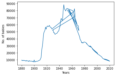
We notice that the graph is somewhat not as we expected. Inspected the filtered data-frame, we notice that the years are not sorted. We can easily overcome this by
name_df = name_df.sort_values("year")
If we plot again we get a proper graph
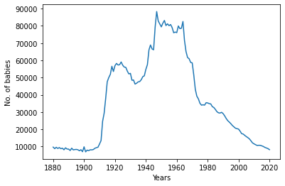
We can change the name and gender to visualize all the different names and how their common they were over the years.
Building the UI
Finally, we can use streamlit, which is a platform for building data apps, for creating a front-end for our application.
First we import it at the top of our file as
import streamlit as st
Now, we can use the st.write() function to write a heading for our app or some other information.
Next, we use two different input methods
baby_name = st.text_input("Baby name", placeholder="Enter a baby name")
gender = st.radio("Gender of the baby", ("M", "F"))
to input the name and gender of our user's choice.
In order to embed the plot in the web page, we must create a matplotlib figure object fig, then use st.pyplot(fig)
Closing remarks
Our web app can be hosted on streamlit cloud. I shall leave that as an exercise to the viewer. Today, we performed EDA and also visualised a large data set (more than 2 million rows long), hope I inspired you to create your own EDA project, maybe with a different data set.
You can find the code on GitHub.
There's also a live version of the web app here
Thank you so much for reading this article. Bye for now!